


 Share on media
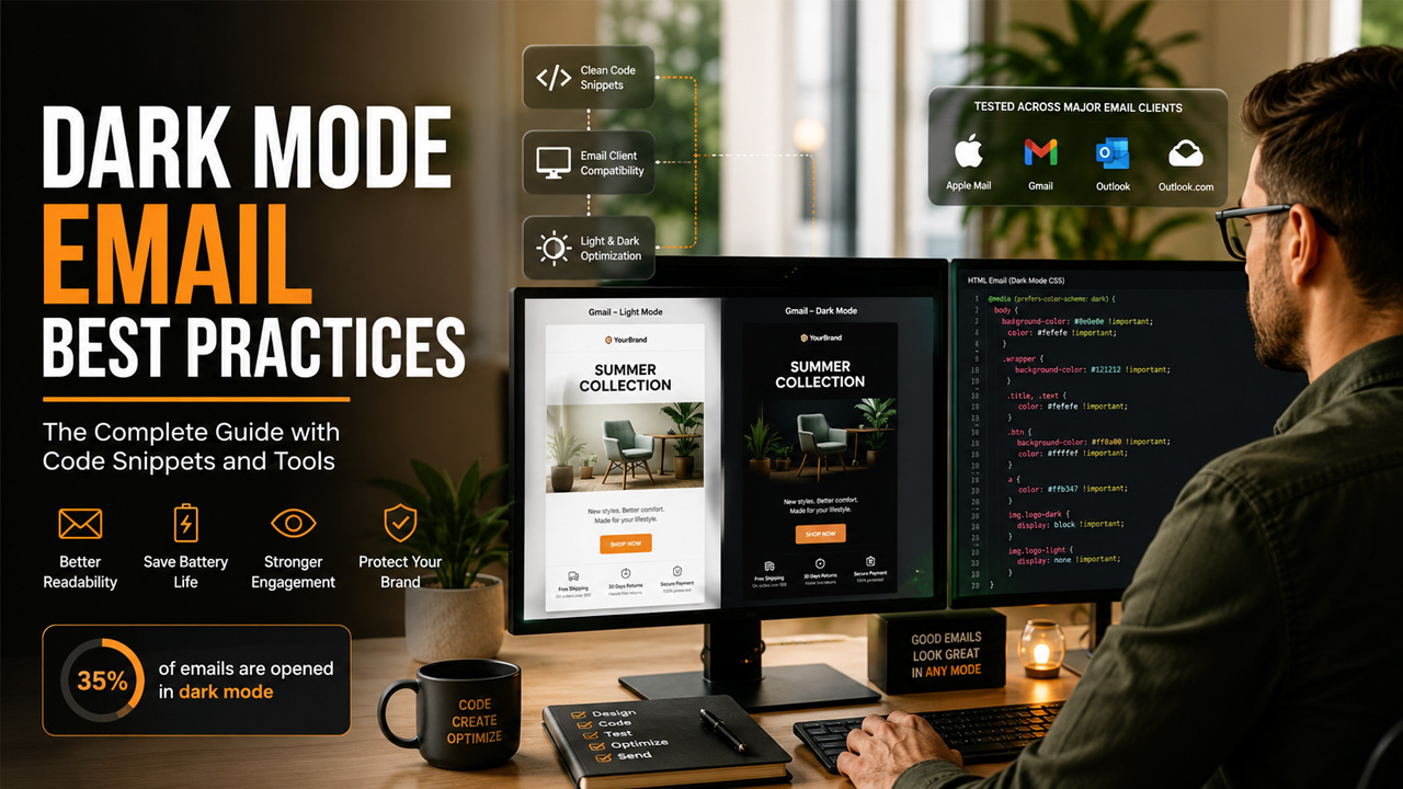
Almost 82% of smartphone users have switched on dark mode in 2024, while only 11% of email marketing professionals regularly optimize their email campaigns for dark mode. This is exactly where your emails are failing, making them difficult to read and less engaging for your audience. If dark mode email campaigns remain a secondary priority for you, then this post will act as your saviour.
Why Dark Mode Is No Longer Optional?
In general, more people read emails at night, on commutes, or in low-light settings. Dark mode makes the reading experience much more comfortable. According to Litmus research, around 35% of consumers opened emails in dark mode as of 2022, and that number has continued climbing as mobile operating systems increasingly default to dark interfaces. On OLED screens, dark mode can also save up to 63% of battery life, which makes it a feature people actively protect on their devices.
The problem is that most email dark mode experiences are not intentional. Email clients handle dark mode in their own way, and several of them forcibly invert your carefully chosen colors, turning a clean white background into harsh black and making your logo disappear into the background.
When all this happens without any CSS override in place, your brand looks broken and unclear. That broken experience results in shorter read times. Recent Stripo’s data shows 43% of dark mode opens lasted only 0 to 2 seconds, against 24% in light mode, which is a direct sign of significantly decreased readability.
How Email Clients Actually Handle Dark Mode?
Not every inbox treats dark mode emails the same way. Knowing the difference between how each client behaves is the first step toward fixing your templates.
Here is a quick reference for the major clients:
| Email Client | Dark Mode Behavior |
| Apple Mail (iOS & macOS) | Supports CSS media queries, partial color inversion |
| Gmail (Android & iOS) | Full color inversion, no CSS media query support |
| Outlook (macOS) | Supports media queries, partial inversion |
| Outlook (Windows) | Aggressive full inversion, limited CSS control |
| Samsung Mail | Supports prefers-color-scheme |
| Outlook.com | Partial inversion of light backgrounds and dark text |
Apple Mail and Outlook for macOS are the most predictable because they allow you to control the dark mode experience using CSS. Managing Outlook dark mode is often easier for email developers since Outlook provides better support for custom styling compared to some mobile email clients. Gmail on mobile is the trickiest because it ignores CSS overrides and applies its own full-color inversion.
For Gmail-heavy audiences, the focus should shift to defensive coding, meaning every element in your HTML needs explicit color values so the inversion at least produces something readable.
The Core CSS Approach for HTML Email Dark Mode
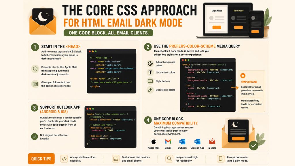
The foundation of any solid HTML email dark mode setup starts in the head of your email. You need two Meta tags and a CSS block that tells email clients your email is already dark-mode ready. This signals to clients like Apple Mail not to apply their own automatic adjustments over yours.
After the Meta tags, the real work happens inside the CSS media query. The prefers-color-scheme: dark media query is the default way of checking whether or not dark mode is active. Within the media query, you would adjust background color, text color, button color, and link styles. The important declaration is mandatory in this case because email providers employ the property to overcome inline styles. Matching the specificity level is crucial here.
As far as the Outlook app on Android and iOS devices is concerned, the solution will differ. The email provider uses their own vendor-specific prefix that needs to be duplicated along with your dark mode styles. Adding data-ogsc in front of each selector won’t make the CSS code more elegant, but it is functional. Combining both solutions makes one code block effective for all email providers.
Image Optimization for Dark Mode Emails
Images are the most common point of failure in dark mode emails. A logo designed for a white background simply does not work on a black background. Product photos with white edges create bright halos. Icons with dark outlines disappear entirely. These are not minor visual glitches; they make your email look weird.
Instead, all you need to do is prepare two versions of every critical image. One version is optimized for light backgrounds, while the other is designed for dark.
The prefers-color-scheme media query in CSS controls which version shows up based on the mode the user has active. For logos specifically, a white or light version works best on dark backgrounds. For product photography, removing backgrounds completely and saving images as transparent PNGs solves the halo problem cleanly.
In addition, a CSS brightness and contrast filter inside the dark mode media query can tone down especially bright images so they do not feel jarring against a dark background. This would be especially important for hero images or lifestyle shots that cannot have an alternate version created.
According to Campaign Monitor, it is important to apply this filter to particular image classes and not all images generally, to avoid affecting images that you want to appear dark.
Color and Typography Practices That Actually Work
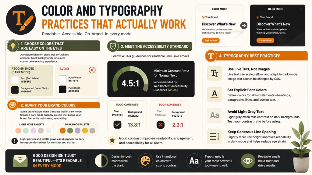
Selecting color schemes to apply to dark mode emails is not as simple as just switching out white colors for black. White text on a black background will actually strain many readers’ eyes because the contrast is too strong. It is advised that colors similar to white, such as #FEFEFE, be used for texts, while near-black colors, such as #0E0E0E, should be applied to backgrounds.
Your color palette also needs to account for brand colors that may not translate to dark interfaces. Light pastel tones and subtle grays often vanish against dark backgrounds. If your brand relies on soft colors, you need a separate dark mode color set that preserves the feeling of your brand while maintaining enough contrast to stay readable.
The Web Content Accessibility Guidelines recommend a minimum contrast ratio of 4.5:1 for normal text, and that standard applies just as much inside an email dark mode context as it does on the web.
Typography-wise, the key practices to keep in mind include:
- Always use live text rather than text baked into images, since image text cannot be adjusted by CSS overrides.
- Set explicit font colors on all text elements, including headings, body copy, and links, rather than relying on inherited or default values.
- Avoid light gray text on dark backgrounds unless you have tested the contrast ratio manually.
- Keep line spacing slightly generous in dark mode designs, since dense text on dark backgrounds is harder to read quickly.
How to Make Email Dark Mode Ready: A Practical Workflow
Just in case you wonder how to create dark mode support in emails from scratch, the task will be easier than one might think. One needs to follow six specific steps regardless of what kind of template you need.
The first thing you need to do is approach the design process with dark mode already in mind. This means that at the very beginning, you have to select a color scheme that suits dark mode and light mode equally. Then move to developing your email using HTML and applying inline styles for all elements. Thus, ensuring that in case of a browser not supporting dark mode, the colors will still contrast.
In the next step, add your Meta tags and CSS block in the head to declare dark mode support. After that, write your media query overrides for Apple Mail and iOS clients, and duplicate those overrides using the Outlook-specific prefix for broader coverage.
Finally, prepare dark mode versions of all critical images and connect them to the media query using show and hide classes.
Tools That Make Dark Mode Testing Easier
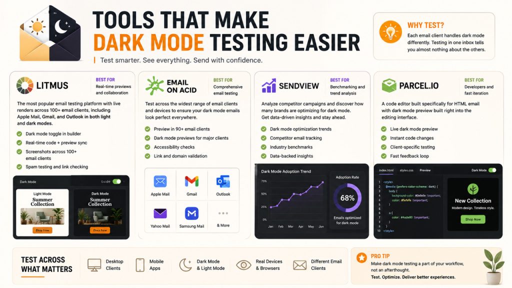
Testing is the step most teams skip, and it is the most important one. Because each email client behaves differently, visual testing in one inbox tells you almost nothing about the others, especially when dealing with Gmail dark mode rendering issues.
Litmus is the most commonly used email testing platform for dark mode previews. It shows you live renders across dozens of clients, including Apple Mail, Gmail, and Outlook in both light and dark states. It also includes a dark mode toggle directly in its builder so you can see changes in real time as you code and identify potential Gmail dark mode display problems early.
Email on Acid is a similar tool and may be employed by teams interested in testing for a wider variety of clients. To teams interested in analyzing competing campaigns or determining just how many companies have adopted the dark mode technology in their coding, Sendview gives aggregate data about optimization trends.
Parcel.io is a code editor built specifically for HTML email and includes dark mode previewing built directly into the editing interface, making it a solid choice for developers who want a faster feedback loop while optimizing emails for Gmail dark mode and other clients.
Stop Letting Dark Mode Break Your Brand
Every campaign you send without dark mode email optimization is a gamble. For a significant portion of your audience, your carefully designed email may be arriving broken, unreadable, or visually inconsistent with your brand. The fix is not complicated, but it does require treating dark mode as a standard part of your build process instead of an occasional concern.
Hence, start with your Meta tags, layer in your media query overrides, fix your images, and test across the clients your audience actually uses. Ensure you do that consistently, and dark mode stops being a problem and starts giving you a competitive advantage.
Frequently Asked Questions
What is dark mode in email, and why does it matter?
About 35% of email opens happen in dark mode. Skip optimization, and you’re handing a third of your audience broken layouts, invisible logos, and unreadable text.
Which email clients support dark mode CSS?
Apple Mail, iOS Mail, Outlook for macOS, and Samsung Mail all respect the prefers-color-scheme media query. Gmail on Android and iOS doesn’t – it runs its own colour inversion and ignores your overrides entirely.
How do I add dark mode without breaking light mode?
Wrap your dark styles in @media (prefers-color-scheme: dark). Light mode stays untouched. Dark mode users, get your intentional design. Two audiences, one file.
Why does my logo disappear in dark mode?
It’s dark-coloured on a white background. Flip the background to black, and it vanishes. Fix: make a white version of your logo and swap it in with CSS – only dark mode users ever see it.
What’s the best way to test dark mode emails?
Litmus and Email on Acid both preview across Apple Mail, Gmail, and Outlook in light and dark. Coding in-browser? Parcel.io has a dark mode preview built into the editor.