

 Share on media
Most businesses send newsletters, but there are very few newsletters people actually want to open and read. That major gap is exactly where people miss the opportunity to bring more revenue to their business. Undoubtedly, email marketing still delivers one of the highest returns of any digital channel, and yet most brands keep repeating the same tired formats, bland subject lines, and copy that feels very generic.
The good news is that studying the best email newsletter examples gives you some useful insight. You can see what works, understand why it works, and apply those insights to your own list without starting from scratch.
This detailed post breaks down real-world examples, the thought process behind them, and real email newsletter ideas you can use right now.
Why Email Newsletters Still Beat Social Media in 2026?
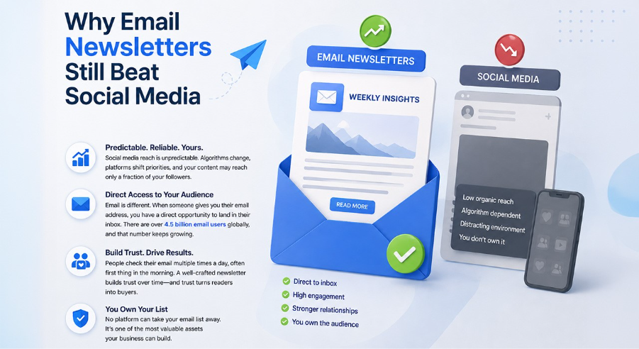
Social media reach has become unpredictable. Algorithms change, platforms shift priorities, and your content may reach only a fraction of your followers on any given day.
However, email is different. When someone gives you their email address, you have a direct opportunity to land in their inbox. The numbers back this up. There are over 4.5 billion email users globally, and that number keeps growing. People check their email multiple times a day, often first thing in the morning.
If your well-crafted newsletter lands in front of your audience consistently, that consistency builds trust over time. Needless to say, trust is a factor that turns readers into buyers.
Also, you own your email list. No platform can take it from you. That alone makes it one of the most valuable assets a business can build. Building a high-quality email list is the foundation of every successful newsletter strategy. Many businesses now use professional lead generation services to find targeted prospects, grow their subscriber base faster, and improve campaign results without relying only on social platforms.
What Separates a High-Converting Newsletter from a Forgettable One?
High-converting newsletters share five qualities: clarity, value, relevance, structure, and a clear next action.
- Clarity is when the reader knows what the e-mail is all about and who it is intended for.
- Value is when the reader is gaining something useful from the email, whether it’s an education, a bargain, or an easier way of doing things.
- Relevance is when the reader feels like the information applies to him/her personally.
- Structure refers to an email that is well-organized, so it’s easy to follow, and the reader never has to work to find what matters.
- A clear next action is when the reader knows exactly what to do after reading, whether that’s clicking a link, replying, or simply taking something away and applying it.
Keep these five pillars in mind as you go through the examples below. They act as a simple filter you can apply to your own newsletters and make it more effective.
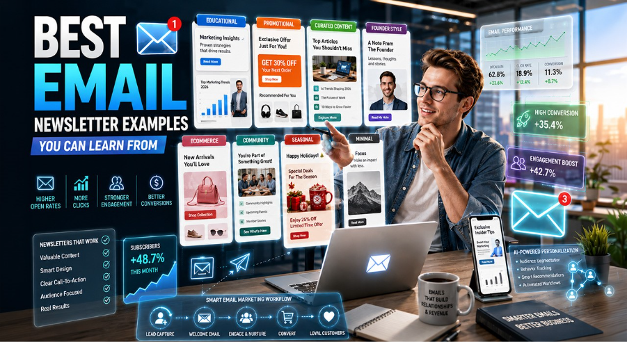
Types of Email Newsletters That Actually Work
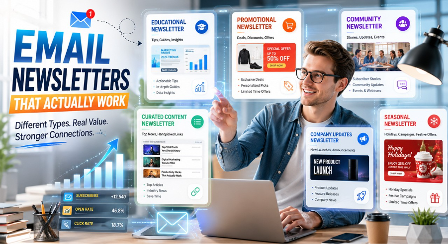
Not every newsletter looks the similar, and that is a good thing. The reason is different businesses have different goals, and the type of newsletter you send should explain what your audience actually needs from you.
Here are the main types worth knowing:
- Company updates newsletter: It updates your audience on the new products and feature launches. This can be done exceptionally well by companies such as Apple where each new launch of their products comes in an email that is short and direct.
- Educational newsletter: Such newsletters deliver real value through tips, guides, and insights. For instance, morning Brew built millions of loyal readers this way. HubSpot’s newsletter regularly shares marketing guides and data reports that their audience genuinely saves and revisits. You can also check out the Top Email Marketing Strategies, to better understand best email marketing practices.
- Curated content newsletter: Helps save time by delivering news from the industry rather than spending time looking for it. The readers receive the best links in one single mail. Hustle and Feedly do this perfectly, as they collect the top articles from the entire internet and compile them into one digestible email.
- Promotional newsletter: They are written to emphasis on discounts or promotions. This type of newsletter is common among Amazon and ASOS companies. Although they differ because the deals that are being highlighted are all based on something the reader already looked for/bought.
- Community newsletter: Topics can range from event information to subscriber stories and updates that make members feel part of the club. For example, Substack writers and Patreon creators use this type of newsletter to engage their subscribers in between releases.
- Seasonal newsletter: Tied to holidays or festive campaigns, seasonal newsletter drives urgency naturally. Brands like Starbucks runs some of the most recognized seasonal emails around the holidays.
Newsletter Design Formats Most People Overlook
Most businesses obsess over what they write, but completely ignore how it looks. That is a mistake, because the format you choose directly affects how long someone stays in your email and whether they click anything at all. This is why the rise of design-first email marketing platforms has changed the way brands approach newsletters—they push creators to think about structure, layout, and readability before anything else.
Here are the main design formats and when to use each one:
- Newspaper style: This style is structured, headline-driven, and easy to scan. It works great for news brands, media companies, and any business that shares multiple updates in one send. Let’s take an example, The New York Times newsletter has clear sections, bold headlines, and a layout that lets readers jump straight to what interests them.
- Magazine style: This style refers to visuals and stories-driven. It is perfect for lifestyle brands, travel, and content-oriented companies. The newsletters of National Geographic utilize the magazine template exceptionally well.
- Minimal text format: It is a clean and concise format, but at the same time personal and unique. Best choice for coaches, consultants, founders, and other people who strive to establish a one-on-one connection with their subscribers.
- Visual-led format: This newsletter design focuses more on visuals than on text. Images lead the conversation while the copy is kept minimal. Used effectively by e-commerce stores like Zara and ASOS.
- Calendar or event-driven: Dates, calendars, and future happenings are the elements of this template. It is considered a great fit for community groups, event planners, and membership-driven businesses.
Mistakes That Kill Good Newsletters
Even the best newsletters fall flat due to a few basic mistakes. One of the most common mistakes is sending newsletters too often, which can cause fatigue and unsubscribes. Similarly, using several call-to-action links in one email is confusing for the reader.
Too many designs in an email may cause it to get flagged by spam filters. User can also use the Email Spam Checker tool, that help in reducing the flagged content from the email. Paradoxically, well-designed emails seem less credible than simple ones. Ignoring mobile optimization is another mistake, especially considering more than 60 percent of emails are opened using smartphones.
The most common mistake, though, is sending promotional content without enough genuine value. Therefore, don’t let these mistakes kill your good newsletter.
The Direction of Email Newsletters in 2026
Email does not seem to be declining in any way; instead, it becomes increasingly intelligent, and those brands that focus on its potential right now get an unfair advantage.
Some of the trends are already taking shape:
- AI-generated newsletters: Businesses are starting to use AI to generate newsletters much faster and more efficiently than before, to automatically test subject lines and to personalize the newsletters without hiring a dedicated team of content creators.
- Hyper-personalization: Mass and generic emails that do not address any specific readers’ interests are already being rejected.Because readers want to receive individually tailored emails based on their interests and behavior.
- Privacy-first data: The era of third-party cookies is drawing to a close, while the use of first-party data becomes the best asset that a business could wish for.
Stop Overthinking It, Start Sending Better Emails
The brands winning with email in 2026 are not the ones with the biggest budgets. They are the ones with the clearest message and the most consistent habit.
So, study the best email newsletter examples in this guide. Pick a format that fits your audience. Write like a human, not a press release. And keep showing up in the inbox with something worth reading.
FAQs
Which type of email newsletter is suitable for a small business?
The minimalist text newsletter will suit most small businesses well. It is relatively easy to create and does not involve designing the content. It also looks personalized and engaging. There are three principles behind this type of email: one topic, one message, and one action.
At what frequency should the email newsletter be sent?
A weekly email newsletter is optimal for most receivers. It is regular enough to remind you about the subscription but not too frequent. However, if it is the first time you send newsletters, then sending them every second week is okay too.
What makes high-converting email newsletters different from regular ones?
High-converting email newsletters are specific, not general. They speak to one type of reader, solve one clear problem, and ask for one clear action. Everything else is kept simple. Conversion happens when the reader feels like the email was written for them personally.
How long should an email newsletter be?
It depends on your format and audience. Educational newsletters can run 400 to 600 words. Curated roundups can be shorter. Promotional emails should be even shorter. The rule is simple: include everything that adds value and cut everything that does not.
What are some practical email newsletter layout ideas to try?
The best email newsletter layout ideas follow a simple pattern that is a strong subject line, one catchy headline, a short body, and a single call to action. A few brands use two columns for roundups, others keep it to one column for simplicity. The fact is the layout that gets read is the right one.